Mădălina Dinu · Permanent makeup
A personal website where every scroll ends in a booking
A site for a permanent makeup artist and trainer in Brașov that feels as warm as her studio, and is built to turn visitors into appointments and course students.
What I delivered
- One-tap WhatsApp booking from every section
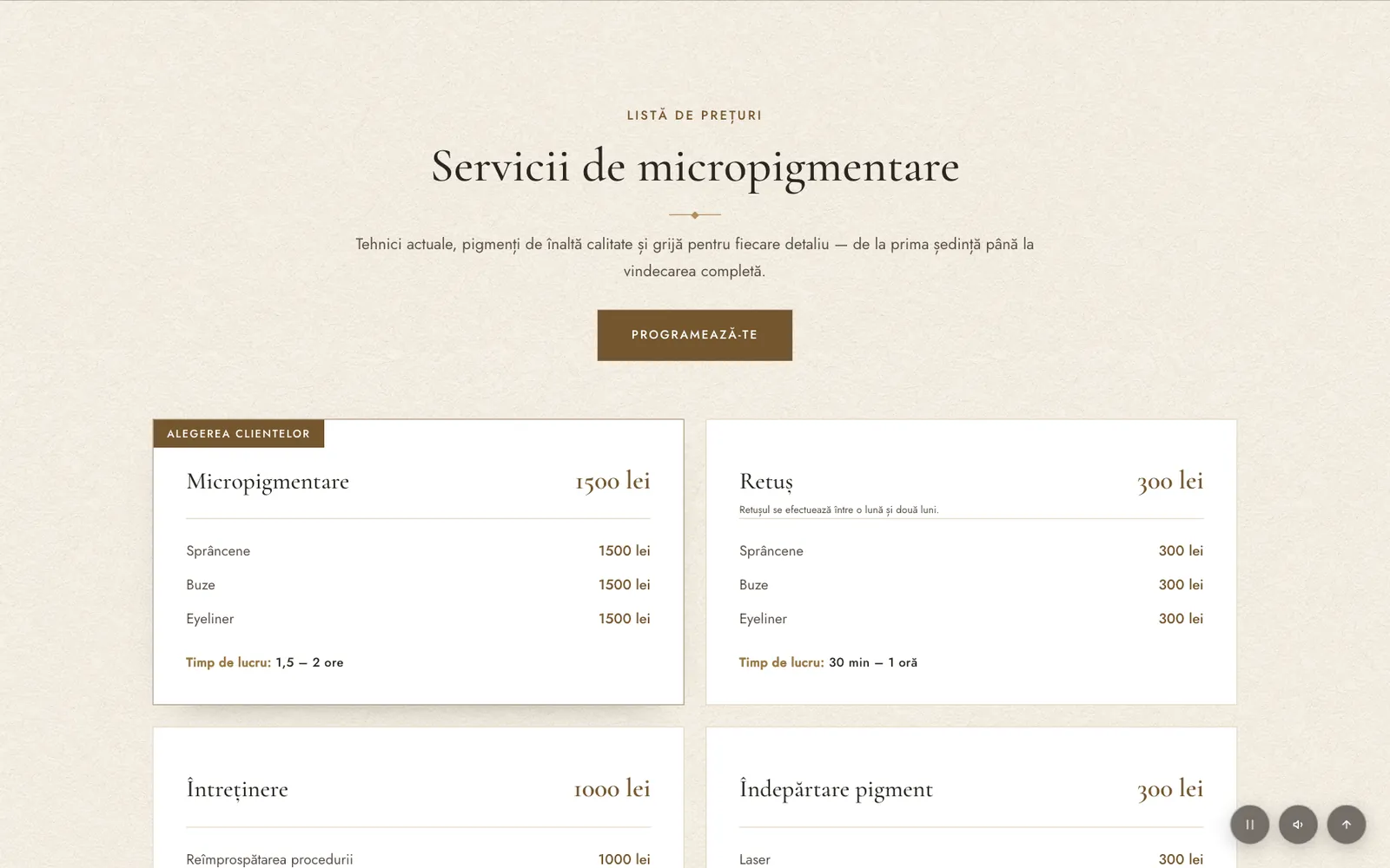
- Transparent price list, no "ask for price"
- A separate path for course enquiries
Role & timeline
- Role
- Web Designer & Developer
- Client
- Mădălina Dinu, permanent makeup artist & trainer · Beauty
- Live site
- madalinadinu.ro (opens in a new tab)
Methods
Overview
Ten years of clients, but no place of her own online
Mădălina has been doing permanent makeup since 2016: brows, lips and eyeliner, for thousands of clients. She also trains women who want to become permanent makeup artists. And she's a mom, which is a big part of how she talks to her audience.
Her clients find her on Instagram, TikTok and Facebook, and book over WhatsApp. What was missing was one place to send them: somewhere that answers the usual questions (price, pain, how long it lasts) and gives anyone curious about her courses a way in.
My goal
Design and build a site that feels personal rather than clinical, answers the usual questions up front, and makes booking a single tap.
Direction
"Real beauty, no filters"
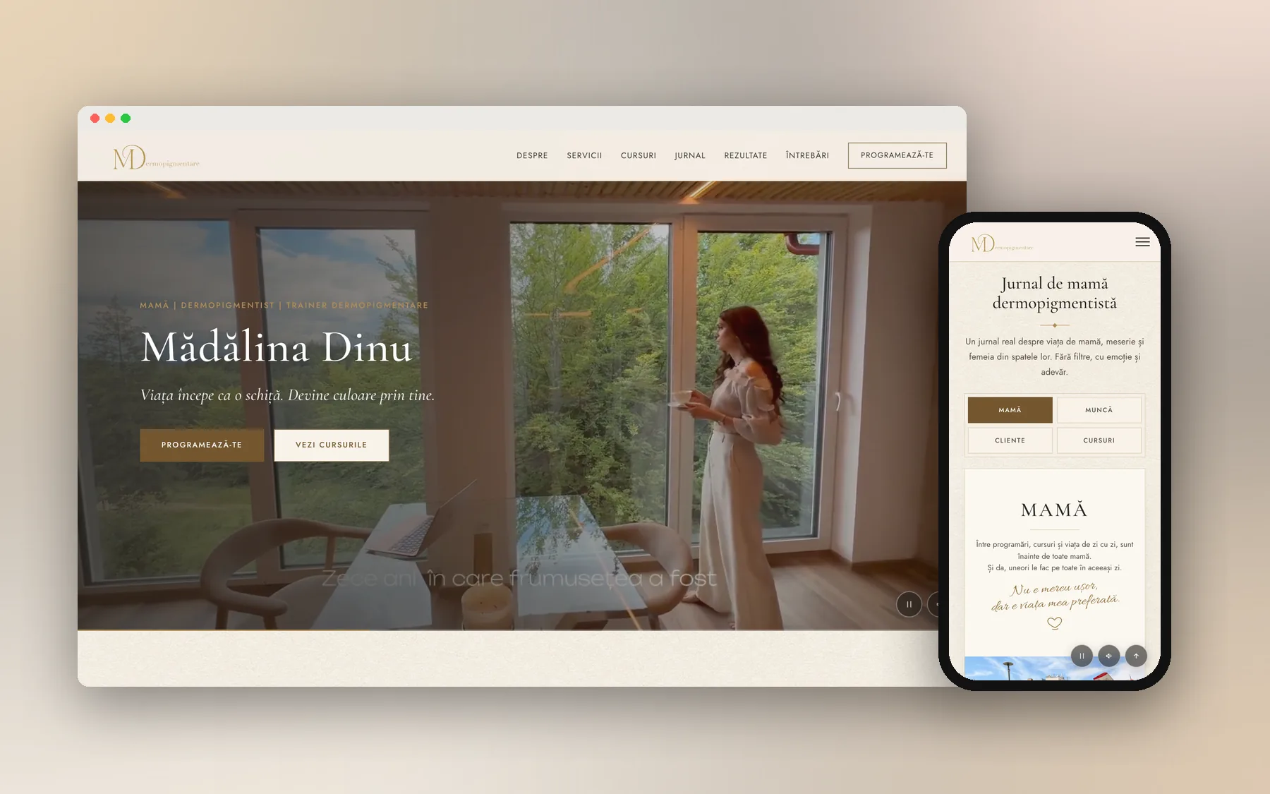
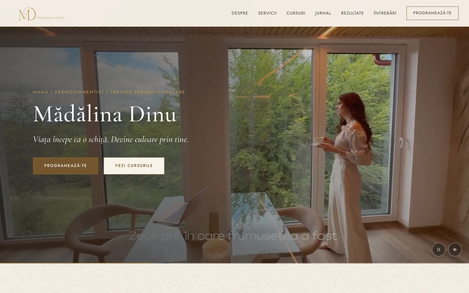
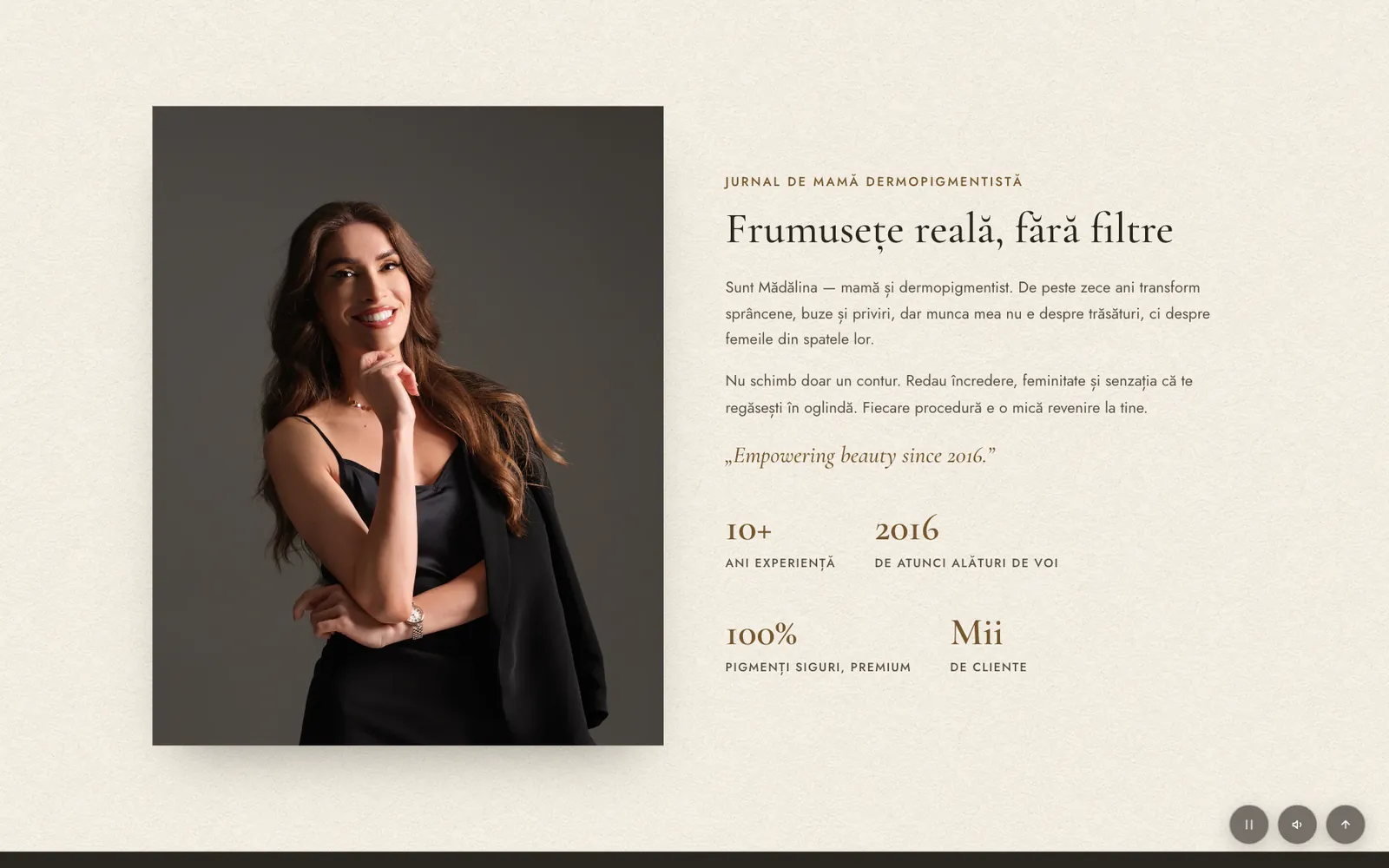
Beauty sites tend to be either pink and glossy or cold and clinical. Mădălina's work is about subtle results and trust, so I went for an editorial feel: warm cream paper, bronze accents, a refined serif for headings and plenty of white space.
The hero opens on a calm, cinematic video with a sound toggle, under her line "Life starts as a sketch. It becomes colour through you." Her own photos carry the page instead of stock imagery.
Information architecture
Answering the questions she gets every day
I built the page around the conversation Mădălina has with every new client: who are you, what does it cost, what does it look like, does it hurt, and how do I book?
- 01
Transparent price listEvery service with its price, duration and when a touch-up is needed. No "message us for prices".
- 02
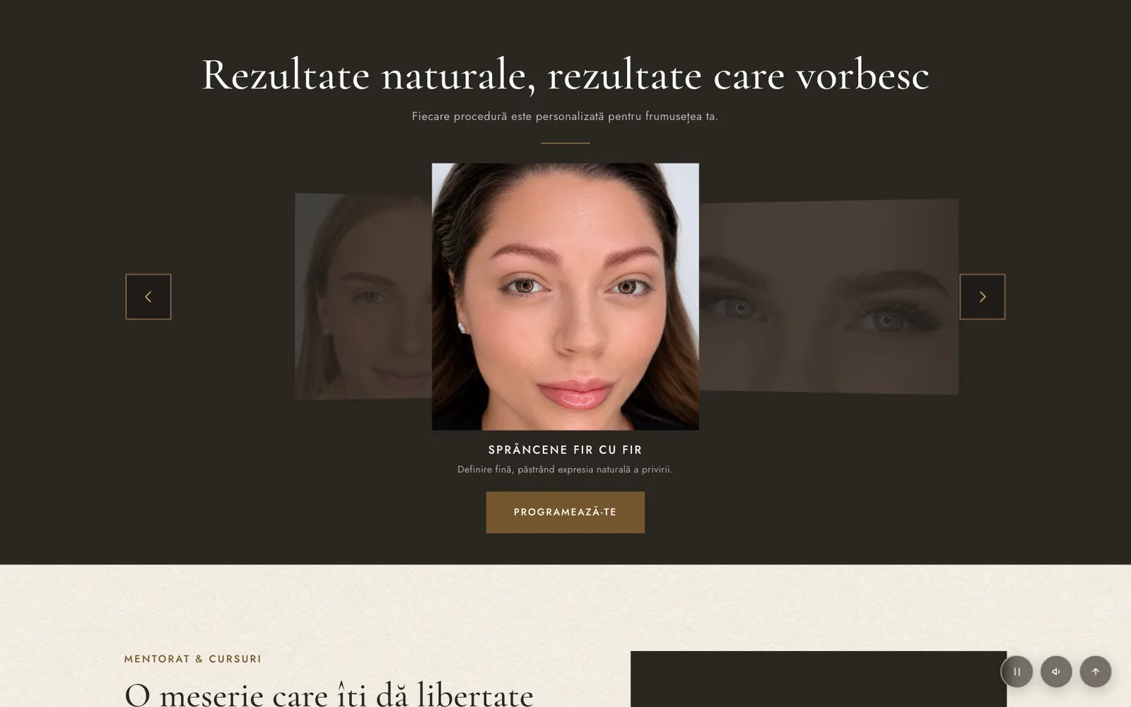
Results that speakA coverflow of real results, one technique at a time, each with a short explanation.
- 03
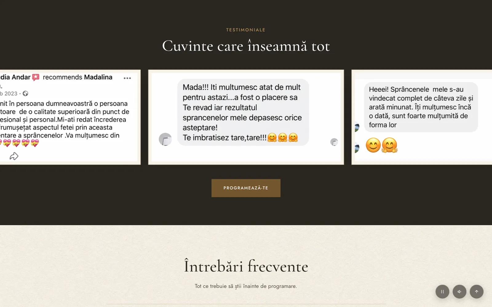
Real testimonialsScreenshots of actual client messages, not polished quotes, to match the "no filters" tone.
- 04
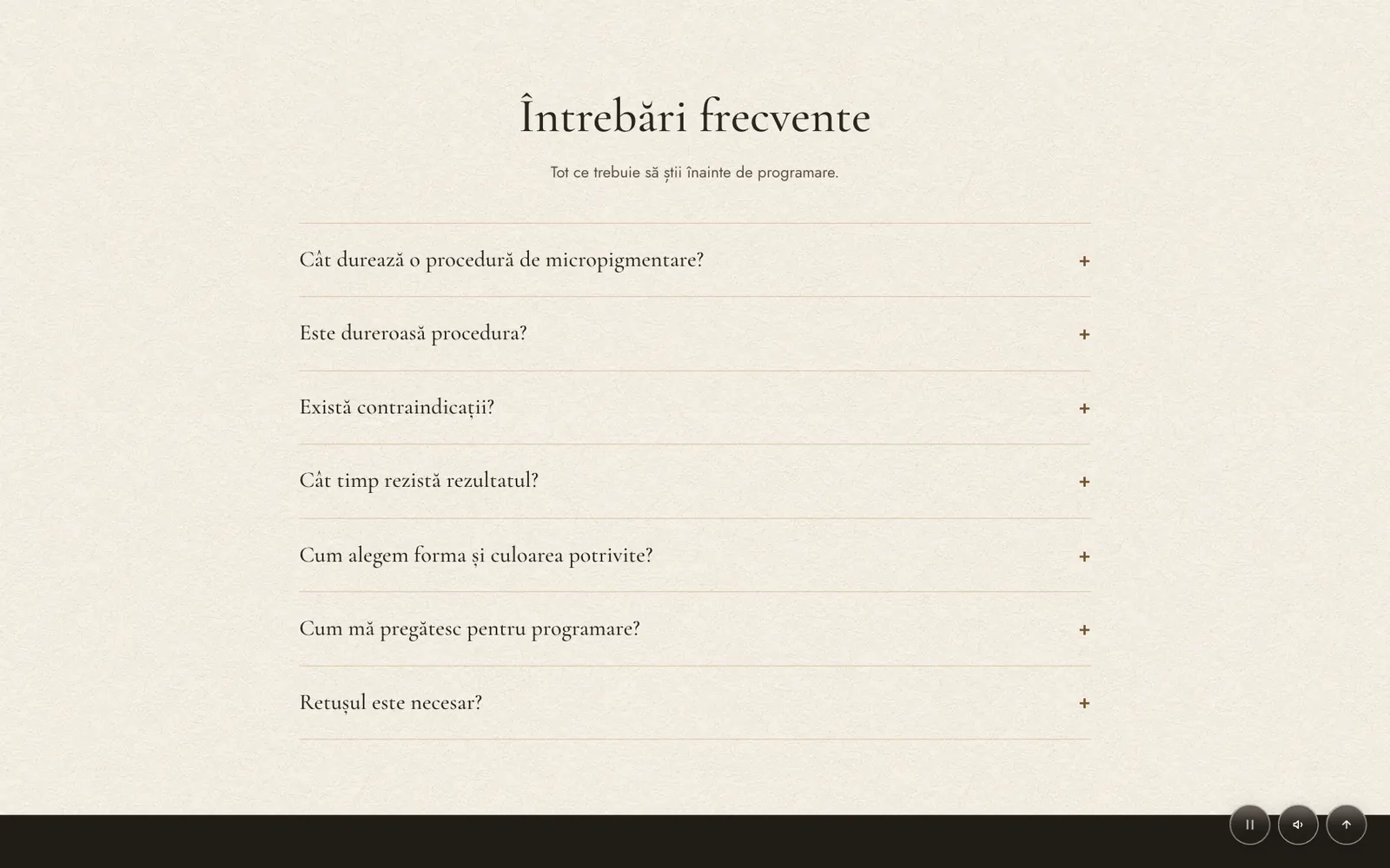
FAQ before bookingPain, contraindications, how long it lasts and how to prepare, answered before anyone has to ask.
Two audiences
Clients and future students, on one page
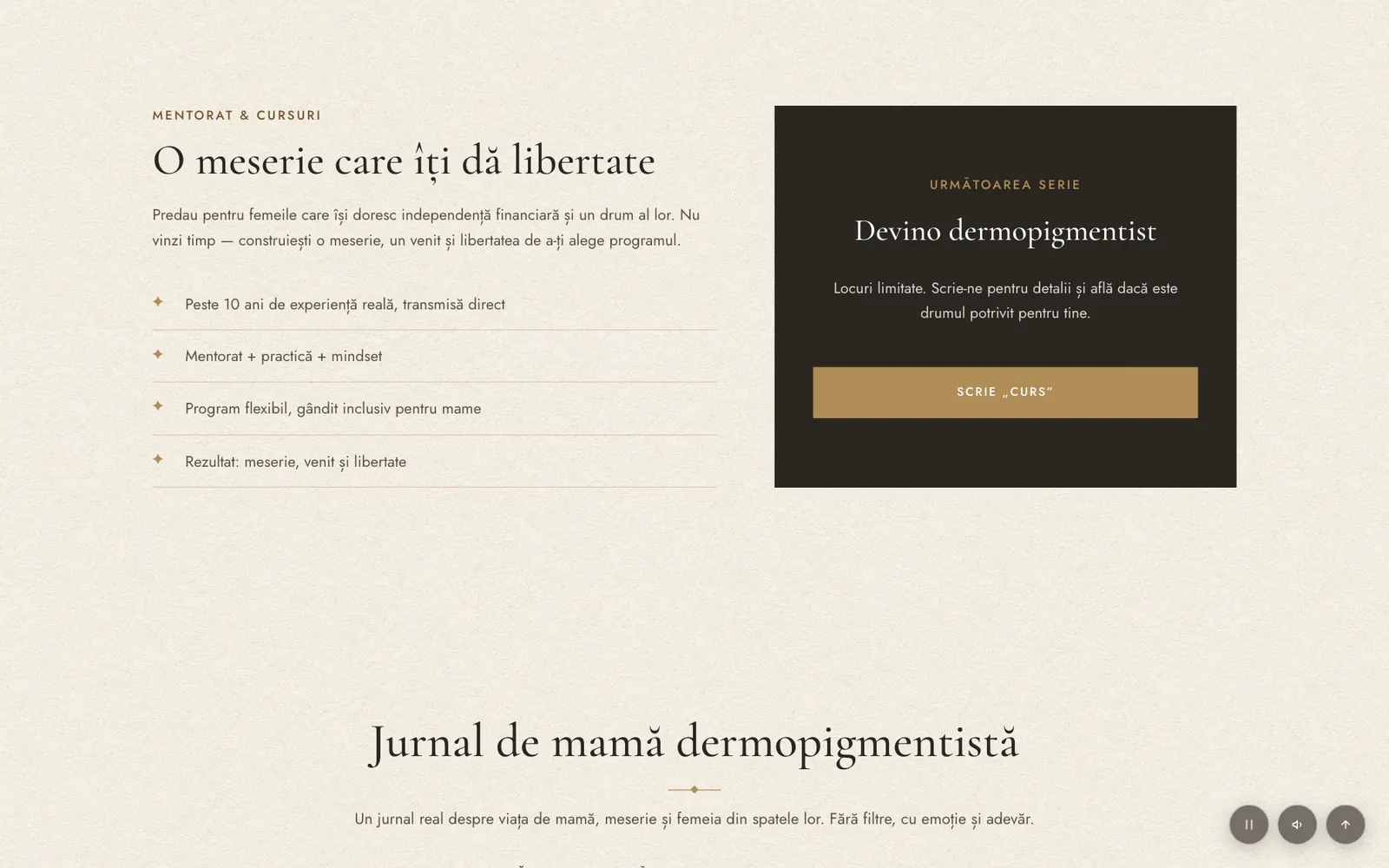
The site has two audiences: women who want a treatment, and women who want to learn the craft. The courses section talks to the second group about independence and a flexible schedule, and has its own call to action: send "CURS" on WhatsApp.
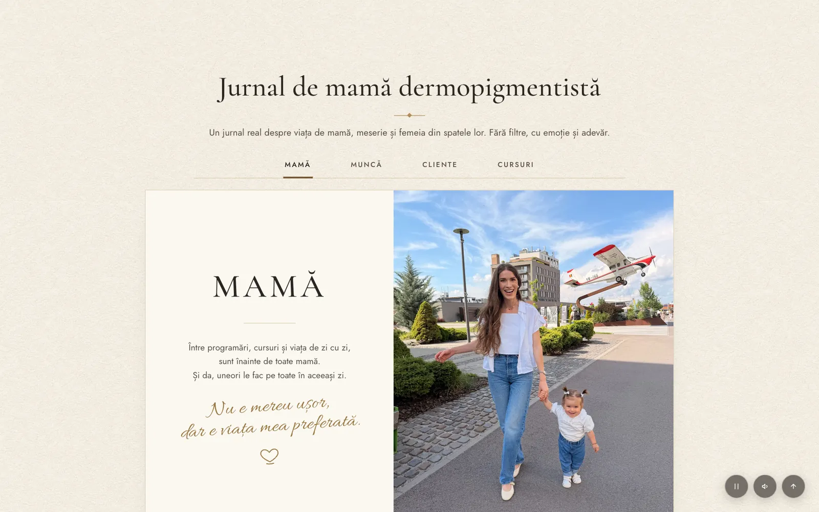
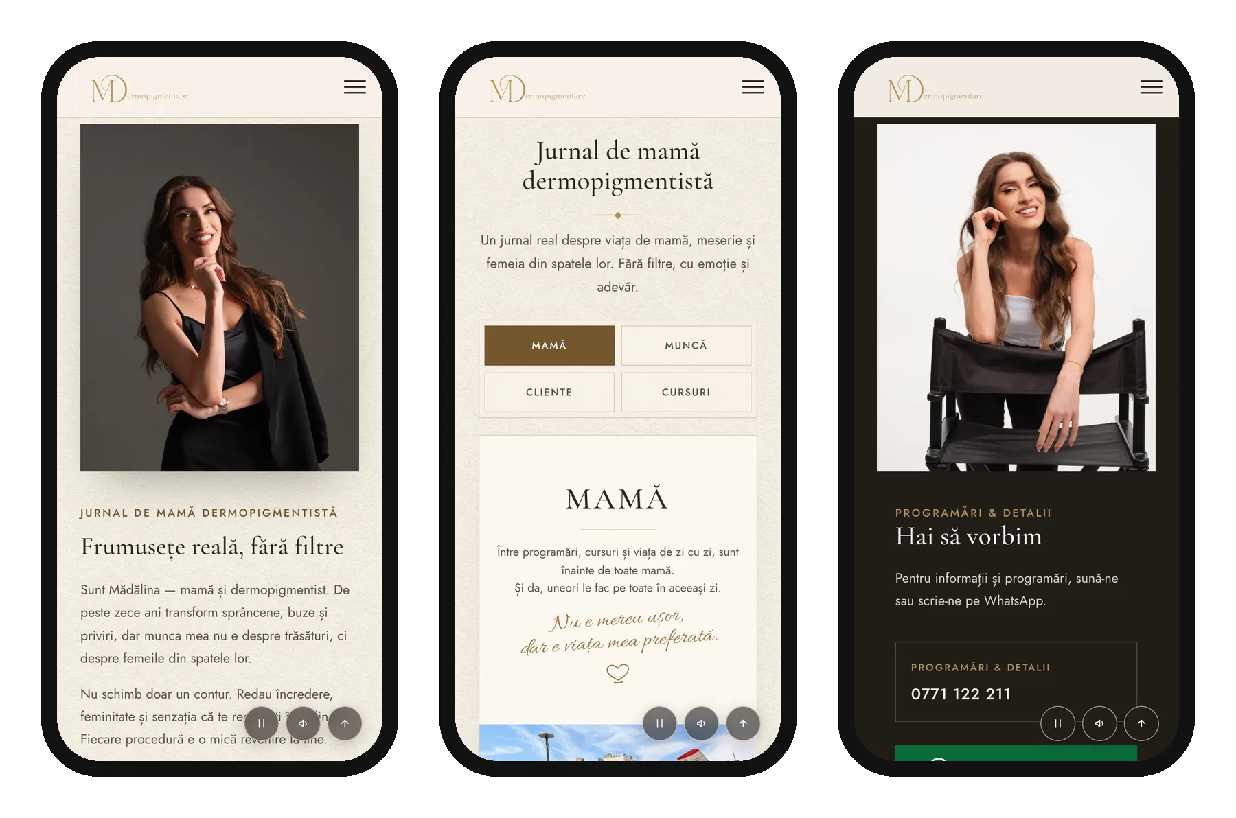
The "Mom & artist journal" ties it together. Tabs for Mom, Work, Clients and Courses show the person behind the work, which is often why people choose her.
Conversion
Booking in one tap, on the app clients already use
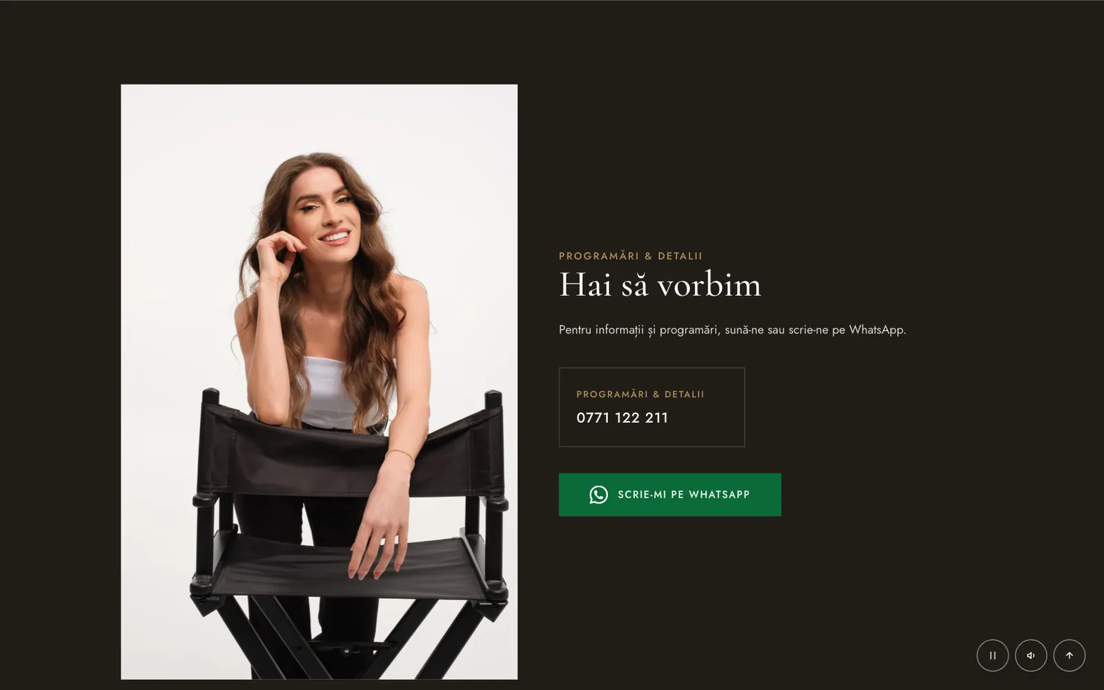
Her clients already message her on WhatsApp, so I didn't add a booking system for them to learn. Every "Book now" button opens WhatsApp with a message already written, and the courses button opens one about the course instead, so she knows straight away what each person wants.
Any section→Book now→WhatsApp, message pre-filled→Appointment
Responsive
Designed for the phone first
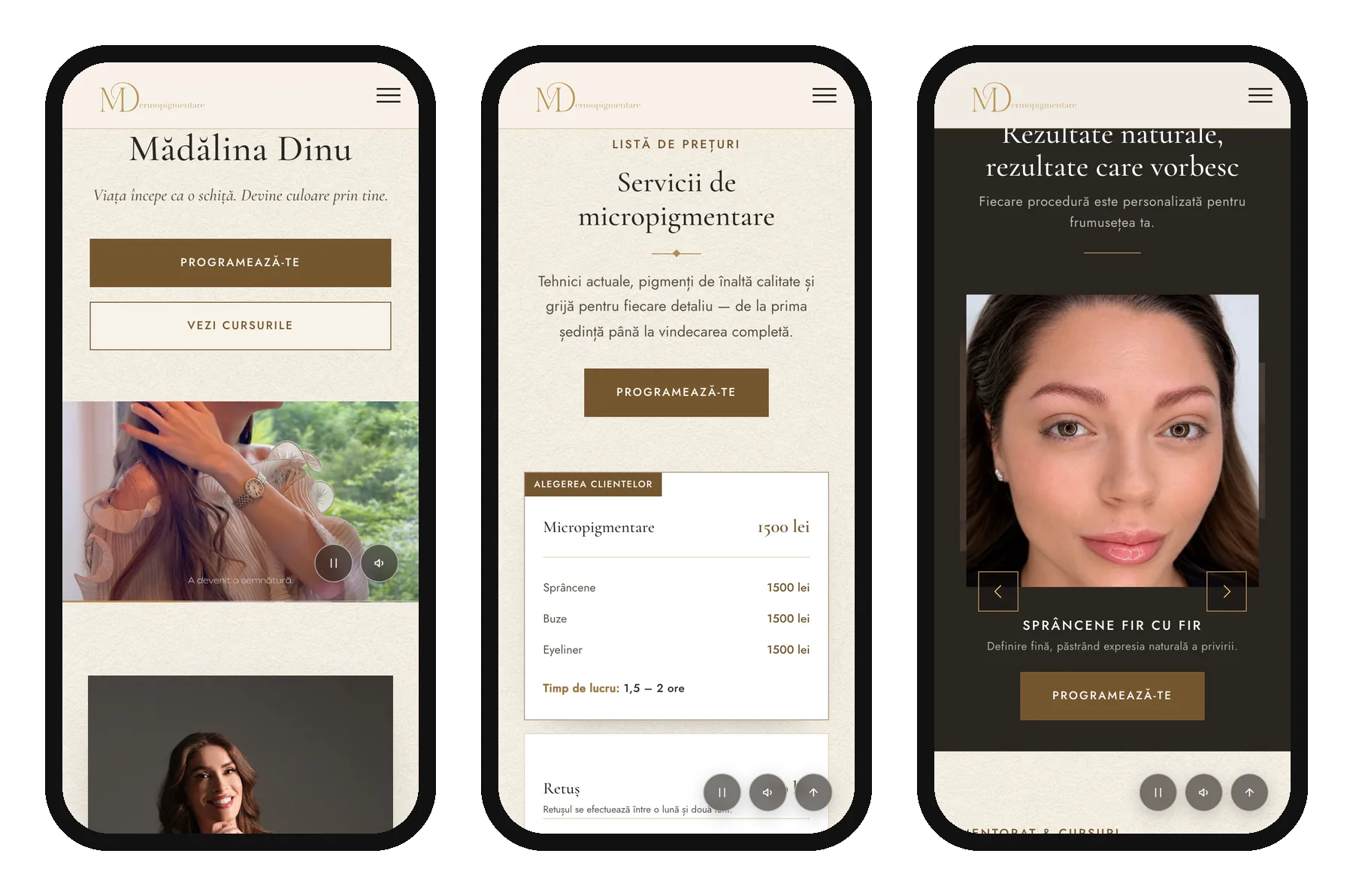
Her audience lives on Instagram and TikTok, so the phone is where the site has to work best. I designed and built every section to work with one thumb: stacked price cards, a swipeable results carousel, and the booking button always close at hand.
Development
From design to a live site
I built the design myself, which meant the details survived into the final site.
Interactions
A video hero with play/pause and sound controls, a results coverflow, a tabbed journal and an accordion FAQ.
Foundations
A responsive layout, search-friendly page titles and descriptions for local searches in Brașov, and pre-filled WhatsApp and phone links throughout.